Insight · 24 April 2025
Demystifying the meaning of hourly matching
Energy Attribute Certificates (EACs) as they are today do not incentivise the addition of new clean energy in locations and times where they are lacking, and where fossil fuels take over. Adding a time-stamp to EACs, and aiming for hourly matching can create that incentive. In this article, we’ll dive into the details of what exactly hourly matching is, how it’s calculated at Granular Energy, and dispel common misconceptions.
For over two decades, Energy Attribute Certificates (EACs) have attributed generated electricity to dedicated consumers, shining a light on the origin of our power and fuelling the growth of renewable energy procurement. By purchasing EACs, entities can claim to be using 100% clean energy as long as the volume of their bought certificates covers their energy consumption – i.e. they are fully “matched” with clean energy. The concept of “matching” or “being matched” depends on the granularity at which you’re assessing the quality of this coverage. This is what is meant by "annual", "monthly", or "hourly" matching.
To date, the market has operated on an annual matching basis where this netting out happens across an aggregate 12 months – a paradigm that the market now recognises does not accurately reflect whether one is truly using renewable energy or fossil fuels. How can it make sense to offset winter consumption with summer electricity generation? Even if calculated at a monthly level, you would still be able to offset night-time consumption with day-time generation. This method isn’t driving the right incentives to add new clean energy to the grid in the right place at the right time to actually displace fossil fuels. Enter the concept of hourly matching.
One of the most common confusions we get when discussing our platform with clients is how exactly hourly matching is calculated. The topic is top of mind with recent legislation and industry moving towards this more granular reporting. As the demand for temporal transparency reaches new heights, hourly matching is providing a whole new level of insight. Two of the most common misconceptions we see are:
- The hourly matching score is the percentage of hours that are 100% covered by carbon-free energy
- An hourly matching score of 80% means that every hour is 80% covered by carbon-free energy
While countless resources have already delved into the reasoning behind this shift and the rise of 24/7 Carbon-Free Energy (CFE), this article aims to detail exactly what hourly matching is, how its calculated here at Granular Energy, and dispel these common misconceptions.
Firstly, what do we mean by annual matching?
Before we examine hourly matching, let’s look at how things currently operate under annual matching. Traditionally, EACs are attributed on a yearly basis which means the yearly consumption of a consumer is matched with the same volume of EACs generated during the same year. We refer to this attributed volume as allocated quantity, a, in the context of this article.
For annual matching, we only require that the EACs were generated within the same calendar year as the consumption to which they’re being attributed. This means an excess of renewable generation during summer months can be attributed to consumption during winter months, which clearly has some flaws! If the total volume of attributed EACs meets the total demand of that year we say that the consumption is 100% matched on an annual basis.
How does that relate to monthly matching?
As you’ve probably guessed, for monthly matching, EACs must be generated within the same month, and for hourly matching, generated within the same hour. You can imagine how meeting 100% hourly matching is significantly harder to achieve than meeting 100% monthly matching!
Imagine that we have bought 200MWh of EACs and had 200MWh of consumption in 2024. Our annual matching score is 100% but we also know that consumption varies month to month. Naturally, we see months in which generation is in excess – meaning the monthly attributed EAC volume exceeds the actual monthly demand – and some months where it's deficient — where we only manage to cover a fraction of the demand. This is expected as, while on an annual basis we are fully matched and the totals net out, there are variations in demand month-to-month across the year.
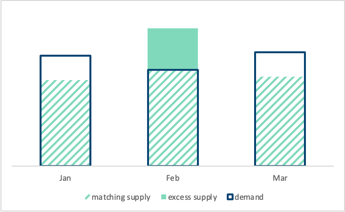
Chart 1: Matching supply and demand volumes on a monthly basis, showing "matching" and "excess" supply
If we compute the monthly matching score for each month, we get the following result:
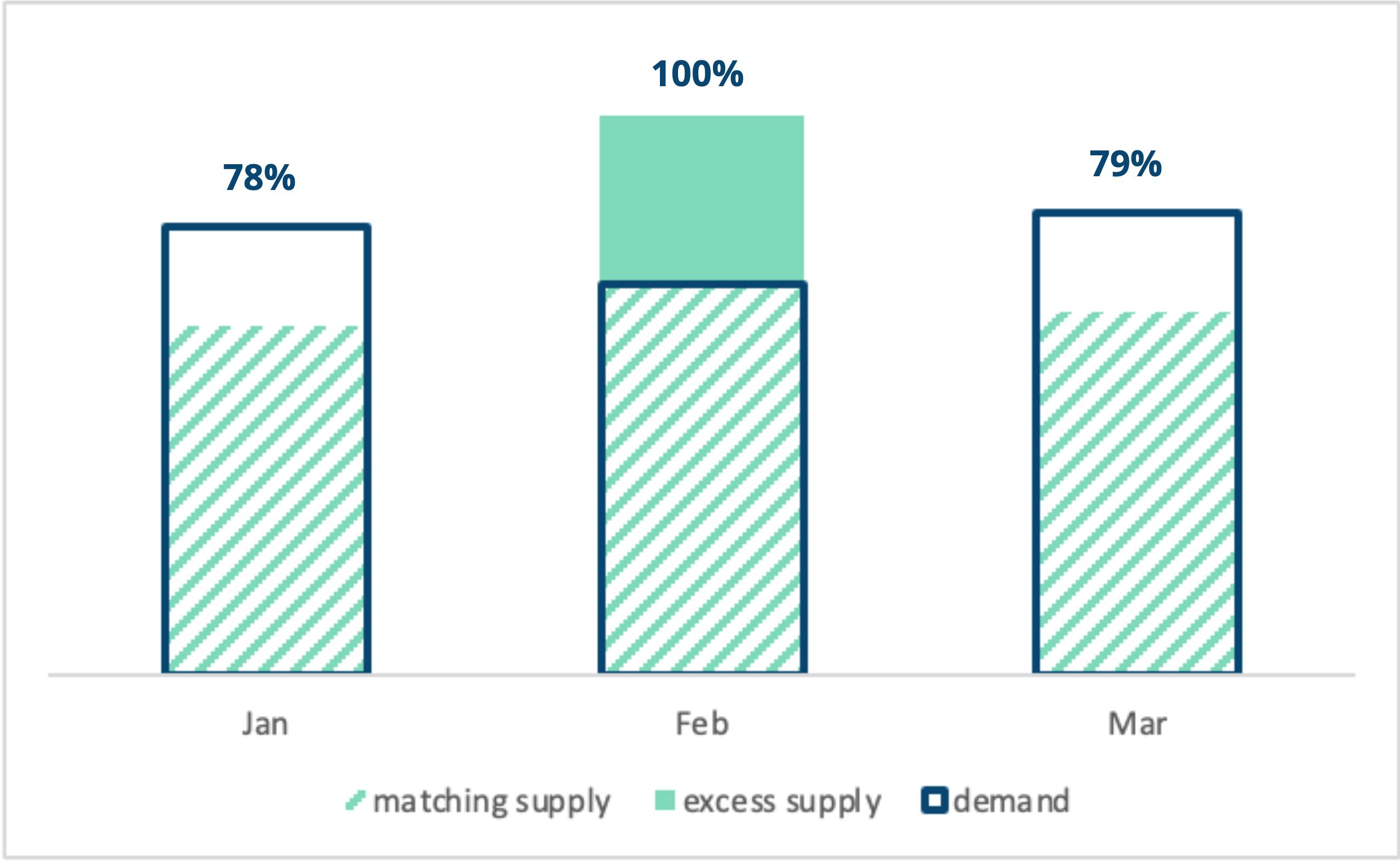
Chart 2: Share of demand volume that is satisfied by matching allocated supply capped at 100%
How did we arrive at these numbers? To be a bit more explicit, let's introduce a few mathematical terms.
The mathematical definition of “matching”
Firstly, in Chart 2, the demand or consumption volume, ct, is shown as the blue rectangles, with our allocated quantity, at, shown in green (both shaded and full). The allocated matching quantity, xt, is then the shaded green area only; the allocated quantity that is no greater than the demand volume. On that last point, our allocated matching quantity cannot exceed demand even if our allocated quantity is greater. This happens in February above. Therefore our matching quantity is the minimum of the two:
Finally, to compute a matching score, st, we take the matching quantity as a percentage of the total consumption, ct:
Here, we’ve purposely used an abstract time-period, t, since these quantities can be defined for each of the annual, monthly, and hourly granularities.
To make this more concrete, let’s apply the above formulae to a monthly granularity (i.e. t represents each month of the year). We therefore calculate our matching score for each and every month of the year using their respective consumption and attributed EAC volume for each month:
To compute the monthly matching score, sm, for a whole year, we take the ratio between the sum of matching allocated supply and the sum of monthly consumption across the entire year.
As we ignore quantities that were allocated in excess, the monthly matching score in our example for a year would yield a score of 85% compared to 100% on annual basis. This makes sense because we’d expect that as our granularity increases and we apply stronger restrictions on which supply can and cannot be attributed to demand, our matching score can only be the same or lower.
Looking at hourly matching
Now imagine in just the same way that we moved from annual to monthly matching, we can examine a day divided into 24 hours. Here’s an example of a demand profile comprised of wind and solar energy throughout the day:
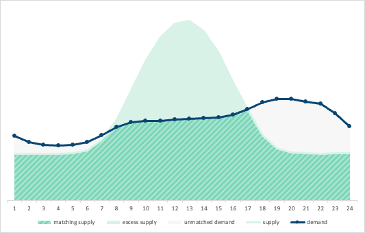
Chart 3: Demand profile matched at 80% on an hourly basis by wind and solar
In this profile, we see baseload wind supply with a daytime spike from solar generation. Demand is relatively consistent with a slight increase in the evening hours.
To calculate the hourly matching score for a full day, we look at the 24 datapoints for each hour of consumption, ch, and allocated supply, ah.
…and compute our matching score for each and every hour.
Or, alternatively expressed as:
Now, if we wanted to compute our hourly matching score for a full year, it’s as simple as extending those 24 hourly datapoints to 8760 hourly datapoints in a full year:
By zooming in to the demand curve on an hourly basis, we get a much more reliable picture of how our consumption is actually being offset by clean energy generation. This is key for informing decisions on demand response activities or investments in complementary carbon-free generation assets.
But EACs are typically issued to a specific month, not hour?
Until we reach the point where EACs are attributed to a specific hour (which isn’t that far off!), we need to create implicit hourly EACs from the monthly EACs that exist today. This is done by using the profile of hourly metering data from generation assets and disaggregating the volume of the monthly certificate according to the same shape. By doing this, you end up with individual hourly EACs where their volume is proportional to the true metering data for the same asset in the same month.
Misconceptions about the hourly matching score
Let’s now look at the two misconceptions we routinely hear about hourly matching.
Misconception 1: The hourly matching score is the percentage of hours that are completely covered by carbon-free energy
This misconception defines an hourly matching score of 80% as 80% of hours in your chosen time period being 100% matched by renewable energy. However, in the previous example, we saw that 9 out of 24 hours (38% of hours) are matched by 100%, yielding an hourly matching score of 80%.
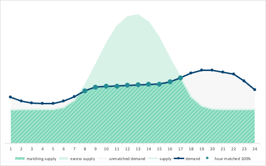
Chart 4: 80% of hourly matching with 9 out of 24 hours (38%) matched by 100% wind and solar
Misconception 1 is also false in reverse – having 80% of hours matched by 100% does not necessarily mean an 80% matching score. There is no direct relationship between these two ratios.
In Chart 5 below, we see a consumption profile with only 2 hours matched fully by 100% of allocated supply, so 8% of hours . However, the matching score in this example is 87%. It’s clear that our matching score still gives us credit for being very nearly matched and therefore can’t be a simple percentage of hours that are fully matched. In fact, mathematically, the matching score is the area below the demand curve that is covered by matching allocated supply.
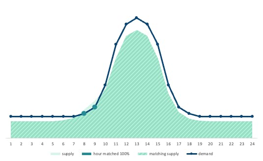
Chart 5: Hourly matching score of 87% with only 2 hours being matched by 100%
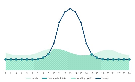
Chart 6: Hourly matching score of 62% with 17 hours being matched by 100%
In Chart 6, the same total energy is allocated to the consumption profile but distributed differently. In this case, 17 out of 24 hours are matched by 100% — 71% of hours. However, the matching score is reduced to 62% because the demand peak at midday is poorly covered by supply. If hours that have high demand are poorly covered, this adversely impacts the matching score, compared to poorly covering hours that have relatively low demand.
In summary, the percentage of hours matched 100% does not correlate with the overall matching score. To reach higher hourly scores, we need to examine the underlying distribution of consumption and the matching allocated supply across all hours.
Misconception 2: the hourly matching score is the percentage that each hour is covered
Another common misconception is that an 80% matching score implies that every hour is covered by exactly 80%. However this isn’t quite right either.
In Chart 7 below, no single hour is matched exactly at 80%, yet we still get an 80% hourly matching score. However, in Chart 8, every hour of demand is matched at 80%, and this does result in an overall hourly matching score of 80%.

Chart 7: 80% of hourly matching with every hour being matched at a different percentage
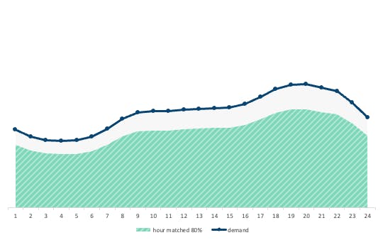
Chart 8: 80% of hourly matching with each hour being matched at exactly 80%
From the hourly matching score alone, we cannot conclude whether each hour is covered by the percentage indicated by the score. Again, we need to examine how the matching allocated supply is distributed across all hours of demand. That said, it’s true that if each hour is matched by exactly 80%, then the matching score over that period is also 80% - it's just not a necessary condition.
To think about this graphically, the matching score represents the area of allocated supply below the consumption curve as a proportion of the consumption area. In Chart 9, that is the ratio between the entire area, A, below the consumption curve and the area of matching allocated supply, B.
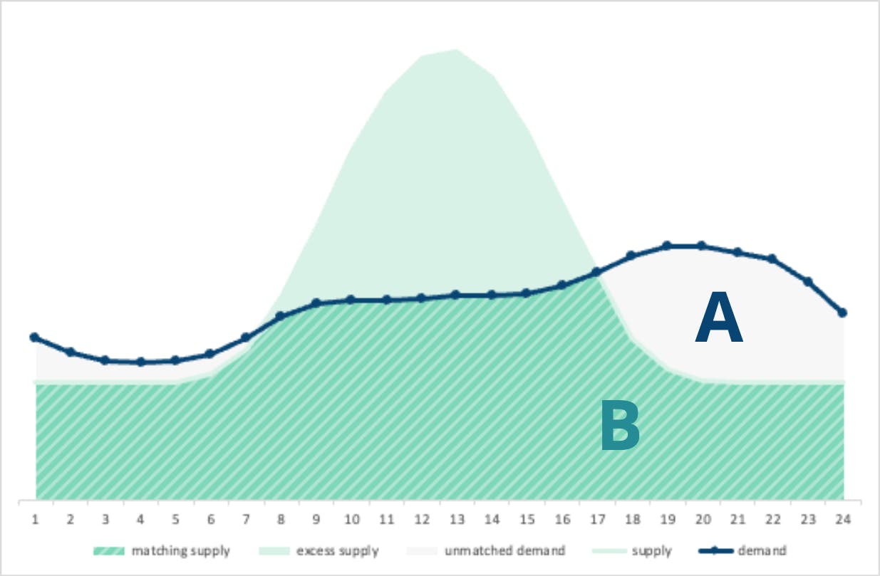
Chart 9: Area A is the area under the demand curve, and Area B is the area under the supply curve
The hourly matching score indicates the ratio between the area A (demand) and area B (supply matching with demand).
Fundamentally, the score is being weighted by the consumption itself – a good matching score during hours of high demand significantly uplifts the overall matching score.
Summary
By adopting higher data granularity through hourly matching, we gain a more accurate picture of how well renewable energy supply aligns with consumption. With an increasing share of renewable energy sources, this approach is crucial for understanding how renewable assets, with their inherent production volatility, can meet energy demand. It also draws attention to the need for investment into demand response, energy storage, and other complementary renewable generation assets to progress in decarbonising the grid by highlighting shortfalls in matching that wouldn’t otherwise exist when measured at lower resolutions such as monthly and annual.
At Granular Energy we provide software that empowers energy suppliers and utilities to understand their supply and demand portfolio on an hourly basis such that they’re better informed when making their procurement and investment decisions.
Share article
More insights
25.06.2026
SBTi's Corporate Net Zero Standard v2: what it means for hourly matching
Last week, the Science Based Targets initiative (SBTi) published the final version of its Corporate Net Zero Standard (CNZS) v2, the first major update to its flagship corporate framework in five years. Over 11,000 companies and financial institutions have committed to science-based targets since SBTi was founded in 2015, making this release one of the most consequential standard updates in corporate climate accountability. The changes to Scope 2 electricity requirements deserve particular attention. Here is what has changed, what it means in practice, and why this signals a pivotal moment for utilities and suppliers.
24.06.2026
50 questions from the room: defending hourly EAC matching at the RECs Market Meeting
I argued for hourly matching in a room that remains to be convinced. They had many questions. That’s the reality of debating hourly EAC matching, and honestly, I wouldn't have it any other way. In a room where most of the audience prefers annual EAC matching, arguing the virtue and need for hourly wasn’t easy. I've done my best to answer the questions below, by topic.